
And the best movie posters of the year are . . .
The Oscars don’t have a Best Poster category. (Or even a Best Title Sequence category, which they did sort of have for the very first Academy Awards in 1929 before—for shame—dropping it in 1930.) So this year, as in the past, we asked some of our favorite poster designers which Best Picture nominee should win Best Poster.
Like book cover designers, key art creators are tasked with the unwieldy ask of distilling an entire universe of story into a single visual. It’s another standard of excellence in cinema—and we’d argue that there’s indeed correlation between great posters and great films. Consider: In our (admittedly wildly unscientific!) 2023 best poster poll, all participants nearly unanimously selected the off-the-wall treatments for the off-the-wall Everything Everywhere All At Once—which took home Best Picture. Last year, Vasilis Marmatakis’s unsurprisingly inventive posters for the unsurprisingly inventive Poor Things dominated—and the film subsequently nabbed Best Actress, Best Production Design, Best Makeup and Hairstyling, and Best Costume Design.
Beneath our water-cooler correlation lies another truth: When a designer utterly nails the brief and creates a poster that rises to a film’s artistic heights, it’s transcendent—and it often yields the singular image we’re left with in our minds long after leaving the theater.
Below, a panel of pros—Jay Bennett, who has worked with Netflix and others; Marie Bergeron, who has worked with Sony, Marvel, Ubisoft, and Warner Bros.; Tori Huynh, who has worked with the Criterion Collection, A24, HBO and more; and Eric Garza and Mitch Putnam, creative directors of pop culture and poster powerhouse Mutant—sound off on their picks for this year’s best Best Picture poster.
“The most effective movie posters make you want to see the movie. A24’s one-sheet for The Brutalist delivers fully in this regard. Director Brady Corbet’s film epic is a bold and uncompromising work that celebrates minimalism and maximalism in equal measure. The poster supports that minimalist/maximalist approach with a design-forward layout that follows principles of Bauhaus and Brutalist design. The art challenges our expectations of traditional movie posters with its bold typography and asymmetrical layout, and is punctuated by an equally impactful visual of Lady Liberty turned on her head—signaling some of the film’s main themes. It’s not just an advert for the film, it feels like an extension of its worldview.” —Eric Garza

“This one got my attention because of its simplicity, boldness, and because it says what it needs to say with very few elements. It’s story with only one image, and I always think that the best posters nail this part. Also, I’ve seen the film and it’s one of my favorites this year, so maybe [that’s why I chose it, too].” —Marie Bergeron

“One of my favorite films of 2024 was The Substance. I love when horror films center the unimaginable dread of being a woman. Strange, sterile, and a pastel gore nightmare, I feel like the posters capture the bizarre icons within the film really well. What came first, the chicken or the egg? Or was the chicken modified, processed and fried beyond our comprehension it is no longer recognizable from its original form? Summarizing all of these elements, and without showing Demi Moore’s face, no less, is such a bold choice. I also love the condensed typeface they used for the title and kept within the entirety of the film. From the look of the key art into the picture, I appreciate the commitment to consistency within the branding.” —Tori Huynh

“I have landed on the U.K. one-sheet for Conclave. I think it’s a bold approach for what is essentially a religious drama to lead with such a vibrant, thriller-esque palette, with the character arrangement creating a hint towards the split of the vote. The highlighted eye as Cardinal Lawrence’s main weapon in this conflict is a nice touch.” —Jay Bennett

“Many times, independent studios will try to push posters that feature big, loud graphic design or illustrative work to help their films stand out. That can be effective, but sometimes a simple piece of set photography is so perfect, it has to be used. Anora had my favorite poster of the year for exactly this reason. The photo screams youth, energy, love and euphoria, which is a hell of a lot to convey in one shot. The type perfectly complements the image and communicates everything necessary while also stepping back just enough so as to not compete for focal dominance. Uncomplicated in its design, this is one of those ‘I could’ve done that’ posters. But you probably couldn’t have.” —Mitch Putnam
Originally published by fastcompany.com. Syndicated material does not necessarily reflect the views of Grazia British.
More Culture

Don’t Pull Out of Germany
Merz’s stupidity is no excuse for a stupid response. Source link
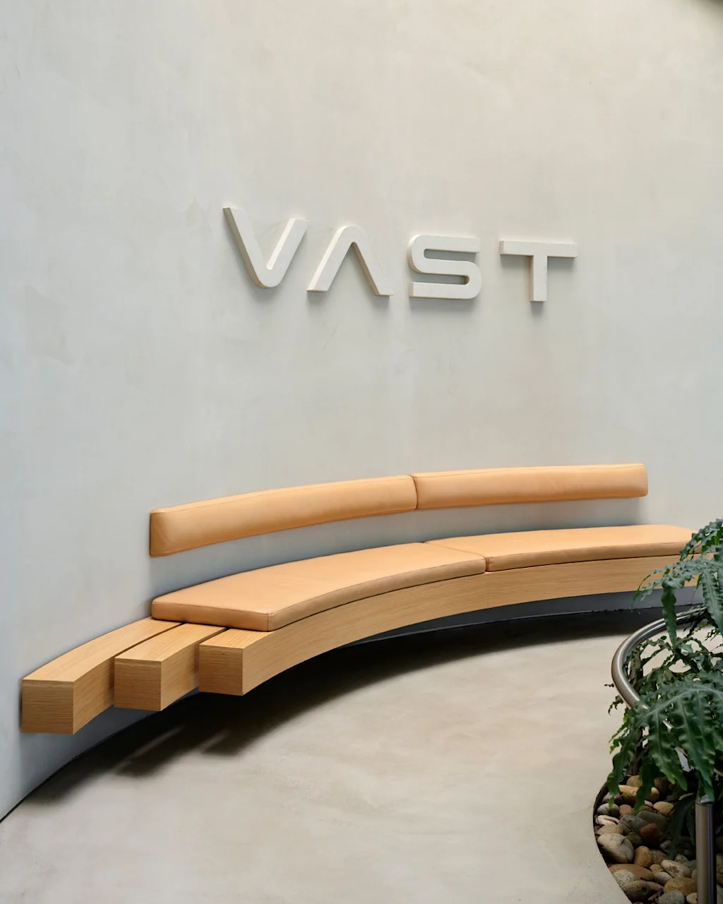
Step inside the gorgeous, futuristic offices of Vast, the startup designing the next-gen space station
A tall baobab tree greets people inside the Long Beach, California, headquarters of Vast, an aerospace company that is building the space station of the future. It’s planted beneath a…

5 ways high-performing teams stay calm when everything’s on fire
When markets swing, plans break, inboxes explode, and everyone starts saying the situation is “unprecedented” again, most teams do what humans have always done under pressure: they grip…

Confused Trump Openly Admits Plot to Rig Midterms as Polls Turn Brutal
Last week, the Supreme Court gutted protections against racial gerrymandering, and Donald Trump is already urging Republicans to seize on it. Trump unleashed a Truth Social rant on Monday…