
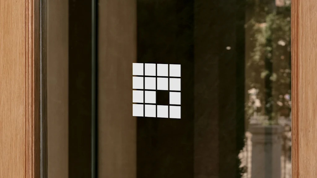
Can you figure out the hidden meaning of this Frank Lloyd Wright logo?
Nearly 500 buildings designed by Wright were built during his lifetime, but almost 15% of those have been demolished or lost through neglect, according to the Frank Lloyd Wright Building Conservancy, an organization that works to preserve the famed architect’s work
Now, a new logo for the organization serves as a reminder of how important it is to protect architectural history. Designed by the studio Order, the Conservancy’s new logo features a missing square that’s meant to represent the void when one of Wright’s buildings is lost or neglected.
The Conservancy’s previous logo was a representation of the Lark Administration Building in Buffalo, New York, which was demolished in 1950. But Order hoped to design a new system for the group that could evolve and move forward.
“Though this building’s story is, of course, important, our goal was to expand what the identity could capture by bringing in the full breadth of their community,” says Garrett Corcoran, a design director at Order.
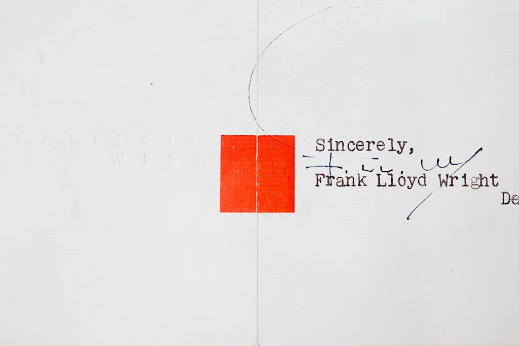
The new logo is a four-by-four square grid that references one Wright’s visual signatures, a red square. Wright used the shape as his own “stamp of approval” on designs, letters, and buildings, and the shape has been used widely in logos for groups associated with his work, like the Frank Lloyd Wright Foundation and the Frank Lloyd Wright Trust.
[Image: Frank Lloyd Wright Building Conservancy/courtesy Order Design]
That widespread use, though, was the reason Order initially explored logo approaches that were slightly different, “to help identify the Conservancy within the landscape,” Corcoran tells Fast Company. That approach didn’t last long, though.
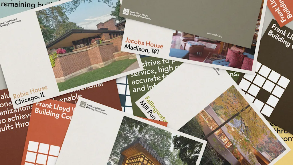
“There was an undeniable truth the square brought when representing Frank Lloyd Wright,” Corcoran says. “Ultimately we came back to it as a foundation we could illustrate through as opposed to a crutch to lean on, embracing it but adapting it to make it the Conservancy’s own.”
Instead of one square, the logo has 15, plus another made from the negative space where the single missing square should be. By representing a missing building abstractly instead of just depicting one outright, the new logo unlocks plenty of new graphic possibilities. It’s a simple form that works well at small scale, and it also tells a story.
[Image: Frank Lloyd Wright Building Conservancy/courtesy Order Design]
“When even one building is threatened, the urgency of our mission becomes clearer,” Conservancy executive director Barbara Gordon said in a statement. “Each and every one of Wright’s built works showcases ideas that inspire, and the Conservancy exists to protect them all, ensuring the ideas they embody will impact the future. Our new identity was built to passionately communicate this.”
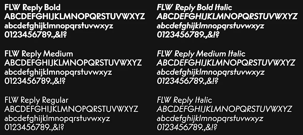
The typeface used in the identity is a customized version of Reply, a geometric sans serif inspired by Wright’s favored font, the typewriter version of Intertype Vogue. The versatile color palette comes with multiple shades to give graphics a sense of depth and light.
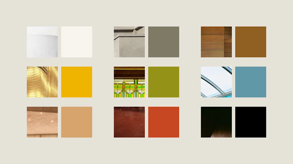
The new logo forms the basis of a larger design system for the organization that uses squares, grids, and block-like shapes for graphics and representations of Wright’s buildings, and the negative space can also be used as a window to show images of his architecture in the opening. For the group’s twice-a-year magazine SaveWright, Order designed an alternate version of the logo that fills in the blank space with a colored square, emphasizing our power to save now what one day could be lost.
Rather than getting boxed in by the square, the Conservancy’s new logo manages to reinterpret a well-worn symbol for the celebrated American architect in a new way.
Originally published by fastcompany.com. Syndicated material does not necessarily reflect the views of Grazia British.
More Culture

Don’t Pull Out of Germany
Merz’s stupidity is no excuse for a stupid response. Source link
Step inside the gorgeous, futuristic offices of Vast, the startup designing the next-gen space station
A tall baobab tree greets people inside the Long Beach, California, headquarters of Vast, an aerospace company that is building the space station of the future. It’s planted beneath a…

5 ways high-performing teams stay calm when everything’s on fire
When markets swing, plans break, inboxes explode, and everyone starts saying the situation is “unprecedented” again, most teams do what humans have always done under pressure: they grip…

Confused Trump Openly Admits Plot to Rig Midterms as Polls Turn Brutal
Last week, the Supreme Court gutted protections against racial gerrymandering, and Donald Trump is already urging Republicans to seize on it. Trump unleashed a Truth Social rant on Monday…